


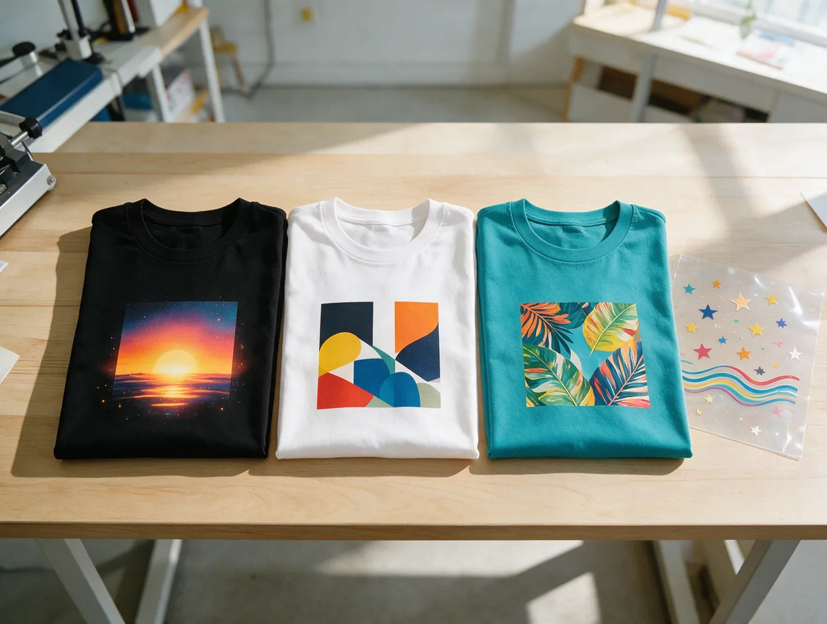
Vibrant DTF prints start with the file, not the press: sharp artwork, saturated colors with strong contrast against the shirt, color judged on fabric rather than on a screen, and black handled the right way for the garment. Our transfers include a white underbase, so colors stay bright on dark garments, and we check and color-correct every file.
Key takeaways
- Dull DTF prints usually start in the file: a blurry image, soft edges, pale colors or weak contrast.
- Saturated colors with clear differences in lightness print brightest; pastels and muddy mixes look flat.
- Screens glow and fabric doesn't, so judge key colors on a real print, not a monitor.
- On dark garments, the white underbase in our transfers keeps colors bright, so don't add your own.
- For Black Knockout, make every black exact #000000; a rich or near-black may print as ink.
In this guide
- Why are my DTF prints dull?
- 1. Start with a sharp, clean file
- 2. Choose colors that print bright
- 3. Design for contrast with the shirt
- 4. Design for fabric, not for your screen
- 5. Get your blacks right
- How do you test DTF colors before a big order?
- Frequently asked questions
- Bright prints start with the file
Why are my DTF prints dull?
Dull DTF prints usually trace back to the file, not the transfer: a blurry or soft-edged image, pale or muddy colors, weak contrast with the shirt, color picked on a glowing screen, or black set up the wrong way for the garment. Match what you see to a cause below, then use the tip that fixes it.
To make DTF colors brighter, fix the cause instead of turning everything up. Pushing every color to full saturation tends to flatten detail and make photos look harsh, while a sharp file, a few strong colors, contrast with the shirt and the right black make the whole design read brighter.
| What you see | Likely cause | Fix |
|---|---|---|
| Soft, blurry edges where colors run together | A low-resolution or enlarged image | Tip 1 |
| A faint haze, speckles or a halo around the design | Semi-transparent pixels from shadows, glows or fades | Tip 1 |
| Colors look flat, chalky or muddy | Pale tints, earthy mixes or many similar shades | Tip 2 |
| The design blends into the shirt | Weak contrast with the garment color, or fine detail on a heather | Tip 3 |
| Darker or duller than on your monitor | Screen light vs ink on fabric, or colors converted back and forth | Tip 4 |
| Black areas look gray, or the shirt shows where black should print | A near-black on a Black Knockout sheet, or Black Knockout on the wrong garment color | Tip 5 |
If a print looked right at first and lost color at the press or in the wash, the first two questions in the FAQ below cover both cases. For prints that crack, peel or won't stick, see our DTF transfer troubleshooting guide.
1. Start with a sharp, clean file
Sharp files look brighter. When an image is too small for its print size, its edges blur and neighboring colors blend into a muddy band, so even strong colors read as soft from a few feet away. Crisp edges keep each color separate, and that clean separation is much of what makes a print look vibrant. Small text and thin lines suffer first, because a blurred edge mixes their color with whatever sits next to them.
Start from the original artwork at the size it will print, at 300 DPI, and keep logos and text as vectors where you can, since they stay crisp at any size. File formats, pixel sizes and the other file rules are on our DTF artwork requirements page.
Shadows, glows and feathered fades are partly see-through, and those pixels can print as a faint haze that dulls the colors beside them. Make effects solid or remove them; the Gang Sheet Builder warns about transparent pixels before you order, and our guide explains how to fix semi-transparent pixels and halos.
2. Choose colors that print bright
To get bright colors in print, start with saturated ones and give them room: a few strong colors with clear differences in lightness read as more vibrant on fabric than many similar shades or pale tints. Saturation is how pure a color is, and lightness is how close it sits to white or black. Contrast inside the design matters as much as contrast with the shirt.
What are good bright colors for DTF?
Good bright colors for DTF are saturated primaries and secondaries: strong reds, oranges, yellows, greens, blues and purples at full strength. Pale pastels, grayish tints and earthy mixes such as brown or olive read flatter on fabric, so use them as accents rather than for the parts that should pop.
| Color choice | On fabric it tends to | What to do |
|---|---|---|
| Saturated primaries and secondaries (red, orange, yellow, green, blue, purple) | Read bold and clear on most garments | Use them for the parts that should pop |
| Pale pastels and light tints | Look soft and can wash out on light shirts | Pair them with a deeper shade or an outline |
| Earthy or grayish mixes (brown, olive, slate) | Look flat | Keep them for accents next to one strong color |
| Many near-identical shades side by side | Blur into one color from a few steps away | Push neighbors apart in lightness |
| Very bright screen-only shades (electric blue, acid green) | Print a little softer than they look on a monitor | Judge them on a printed sample (tip 4) |
Fewer, bolder colors usually look punchier than many similar shades. Push neighboring colors further apart in lightness so each one reads clearly, and where two colors touch, a thin white, black or contrasting outline keeps the edge crisp. A simple starting palette: one strong hero color, one or two supporting colors that differ clearly in lightness, and white or black for outlines and text.
How do you brighten a dull photo for DTF?
Brighten a dull photo gently before you export: lift the levels a little, add a touch of vibrance before you reach for saturation, and keep the photo sharp at its final size. Vibrance boosts muted colors without turning skin tones orange, which heavy saturation tends to do.
On a black shirt, the darkest parts of a photo blend into the fabric, so lift the shadows slightly or set the photo inside a solid, lighter border. On a white shirt it works the other way: pale sky or bright highlights at the edge of a photo fade into the fabric, and a slightly deeper border keeps the edge visible.
Check faces and whites after each change, and step back if skin looks orange or whites pick up a tint. DTF prints photos and gradients in full color, so there's no need to cut a photo down to a few flat colors. Flat, bold colors, on the other hand, give a DTF print a clean, screen-print-like look; see how DTF compares with screen printing.
3. Design for contrast with the shirt
A color only looks vibrant next to something different. A navy design on a black hoodie or pale yellow on a white tee nearly disappears, even when the print itself is perfect, so choose colors for the garment they'll sit on.
- Light on dark, dark on light. Bright colors stand out on dark garments, and deep colors stand out on light ones. On a white tee, pale yellow, light gray and soft pastels are the shades that fade.
- Add an outline. A solid outline in white or a contrasting color separates a design from a shirt of a similar color.
- Watch heathers. Heathered fabric has a speckled texture, so small, low-contrast details can get lost. Bolder shapes read better.
- Mind mid-tone shirts. On red, royal blue or kelly green, colors close to the shirt's own hue disappear; white, black or a much lighter or darker shade reads clearly. On a red shirt, for example, orange and pink fade first.
- Mock it up. Place your artwork on a photo of the garment color to check the contrast before you order. Even a plain rectangle in the shirt's color behind the design shows most problems.

Which colors stay bright on dark shirts?
Light, saturated colors stay brightest on dark shirts: white, yellow, orange, bright red, pink, lime and sky blue all stand out on black, navy and similar garments. Our transfers include a white underbase, so those colors stay bright on dark fabric, and you don't add a white layer to your file.
What fades is anything close to the shirt's own darkness: navy, deep purple, forest green, brown and charcoal sit too close to a dark shirt to stand apart. The underbase stops the shirt from showing through, but a dark color printed over it is still dark. Lift those shades to a brighter version, such as royal or sky blue instead of navy and kelly or lime instead of forest green, or add a light outline.
For text and thin lines, white or a light yellow reads from the farthest away. Dark heathers work like dark shirts with extra texture: use the same light colors, in bolder shapes.
If black is part of the artwork and the shirt is black, charcoal or deep heather, Black Knockout lets the shirt itself be the black, as tip 5 explains. Still choosing blanks? See which shirt colors print well.
4. Design for fabric, not for your screen
Two things make a print look different from the design you saw: the screen you viewed it on and the way the file's colors were handled. Plan for the screen first, then keep the file's colors consistent.
Why does my print look darker than my screen?
Screens glow and fabric doesn't. A monitor makes color with light, while a print reflects light from ink on fabric, so the same color usually looks a little less bright on a shirt than on screen. Phones and laptops also show one file differently.
- Pick colors at normal screen brightness, with night mode and warm-light filters turned off, since both shift every color you see. If your screen has a vivid or boosted color mode, switch to a standard one.
- Compare against a printed sample, not another screen or a paper printout. A phone, a laptop and a monitor can each show the same file differently, and a home printer uses different ink on a different surface.
- Judge in daylight. Indoor bulbs tint colors, so check key shades by a window or outdoors, from the distance people will see the shirt; the test routine below has the steps.
We accept RGB or CMYK; avoid converting a design back and forth between them, because each conversion can flatten some colors. The file settings are on our DTF artwork requirements page, and we check and color-correct every file.
5. Get your blacks right
Decide whether each black area should be printed or should be the shirt. On a Black Knockout DTF transfer, no black ink is printed: areas set to exact #000000 are left open, so the black, charcoal or deep heather garment shows through. On a standard transfer, black is printed in black ink like any other color.
| Situation | Set black as | Why |
|---|---|---|
| Black Knockout on a black, charcoal or deep heather garment | Exact #000000 | Knockout needs pure black; the shirt then becomes the black |
| A near-black or rich black on a Black Knockout sheet | Change it to #000000, unless you want it printed | A black that isn't #000000 may print as ink |
| A standard transfer on any garment color | Black as you designed it | Black prints in black ink |
| A Black Knockout design on any other garment color | Order it as a standard transfer | Knocked-out areas would show the shirt color, not black |
Every area you want knocked out must be exactly #000000. A near-black that looks the same on screen may print as ink instead. When the black is right, knocked-out areas match the shirt exactly, because they are the shirt. On charcoal or deep heather, that means the black parts of your design take on the shirt's own shade.
What is rich black, and when does it apply?
Rich black is black built from several inks instead of black ink alone, a habit from paper printing that makes printed black look deeper. That advice only applies where black is printed, as on a standard transfer. For Black Knockout, skip it and set every black to exact #000000; a rich-black mix may print as ink.
Unsure which black to send for a standard transfer? Send the file as you designed it; we check and color-correct every file.
Knockout designs print on their own sheets, apart from standard designs, and they have a builder of their own. If one order has both kinds, plan two sheets: knockout designs on one and standard designs on the other. Our DTF guide compares standard and Black Knockout transfers side by side.

How do you test DTF colors before a big order?
Press a real sample on the shirts you'll actually use and look at it in daylight. Our free DTF transfer sample pack is an easy way to start: the pack is free, you pay $4.99 for shipping and get it back as $4.99 store credit, or you pick it up free in Alpharetta.
- Press sample transfers on the exact blanks you plan to order, in each color: light, dark and heather. The same color name can vary from one brand to the next, and a color that pops on a white tee can sink into a navy one.
- To see your own design, order a single transfer by size first; there are no minimums and no setup fees, so one piece is enough. Pick the size you'll really print, since small details read differently when they shrink.
- Look at the prints in daylight and in indoor light, up close and at arm's length, the way people will see the shirt.
- Compare them with your screen at normal brightness. Expect a little less glow on fabric; a shade that looks like a different color altogether is worth fixing.
- Adjust and lock the file, with a brighter shade, an outline or exact #000000 for knockout areas, then order the run from that same file.
Before the run, check all five: a sharp file, a bright palette, contrast with the shirt, color judged on fabric and the right black. Keep the approved sample with the file as your color reference for the next order. If the shirts will be washed often, put one pressed sample through a wash first, following the care steps in the FAQ.
Frequently asked questions
Can pressing make DTF colors look dull?
It can, though the file is the more common cause. Too much heat can scorch light fabric or draw dye from dyed polyester into light colors, and a second press with no cover sheet can leave shiny patches. Press our transfers at 320°F (160°C), medium pressure, 15 seconds, peel cold, then press 5 seconds under parchment paper or a Teflon sheet. See DTF heat press settings and, for dye bleed, what you can put DTF transfers on.
How do you keep DTF colors bright after washing?
Wash gently: inside out, in cold water, with no bleach and no dry cleaning, then air dry. Our transfers are lab tested for 100+ washes, and those care steps help the colors stay bright. Why each step matters is in our guide on how to wash DTF shirts.
Can DTF match an exact brand color?
Close, but check it on fabric. A screen, a printed swatch and a shirt each show color a little differently, so build the file with your brand's exact color values, press a sample on the real garment and judge it in daylight before a big order. We check and color-correct every file.
Is there a free DTF color chart?
Some suppliers post charts online, but a chart on a screen glows just like your design does, so it can't show how a color will print. To see real DTF color on fabric, press transfers from our free sample pack on your own blanks. To check your own colors, order one transfer by size first; there are no minimums.
Does your design software change DTF colors?
Not by itself; what changes color is how the file is set up and exported. Keep the color mode you designed in, export at the final print size and check the file against our DTF artwork requirements. Free design programs are covered in our gang sheet guide, and the Gang Sheet Builder runs free in your browser with no account.
Do you need a 9-color printer for bright DTF prints?
Not if you're buying transfers: some printers add extra ink colors to reach a few brighter shades, but that's the print shop's equipment, not something you set up. What you control is the file: a sharp image, saturated colors and strong contrast with the shirt, checked on a pressed sample. On dark garments, the white underbase in our transfers keeps those colors bright. If you print your own film, see buying a DTF printer vs outsourcing.
Why do DTF colors look different indoors and outside?
Because light changes color. Daylight, warm indoor bulbs and cool office lights each shift how a print reads, and a screen adds its own glow on top. Judge important colors on a printed sample in the light where the shirts will be worn, such as daylight for an outdoor team event, and compare samples side by side under the same light.
Why do blacks look gray on my DTF print?
Usually because of the file: a black that is really a very dark gray, or black with partly transparent pixels, prints lighter than solid black, so check that every black is solid and fully opaque. On a black, charcoal or deep heather shirt, Black Knockout skips printed black entirely: areas set to exact #000000 show the shirt itself (see tip 5).
What is color gamut, and why does it matter for DTF?
Color gamut is the range of colors a device can show or print. A screen mixes light, so it can show some very bright shades that printing inks can't reproduce, and those shades print a little softer than they looked. Build the parts that must pop from strong colors that print well (tip 2), and check critical shades on a printed sample.
Bright prints start with the file
Sharp files, bright colors, strong contrast, color judged on fabric and the right black: get those five right and your designs have every chance to look bold on fabric. Planning a whole order? Sizing, ordering and pressing mistakes are covered in our guide to common custom printing mistakes. When your file is ready, order transfers by size, build a gang sheet in your browser or upload a ready-made sheet.


